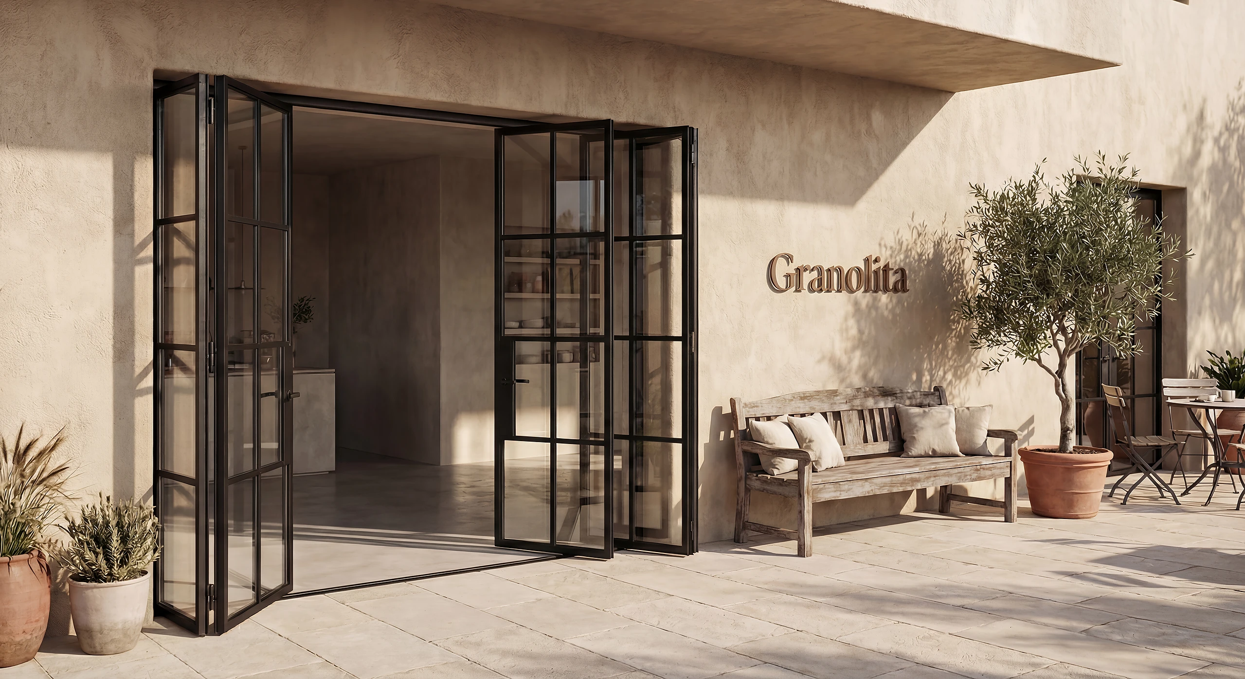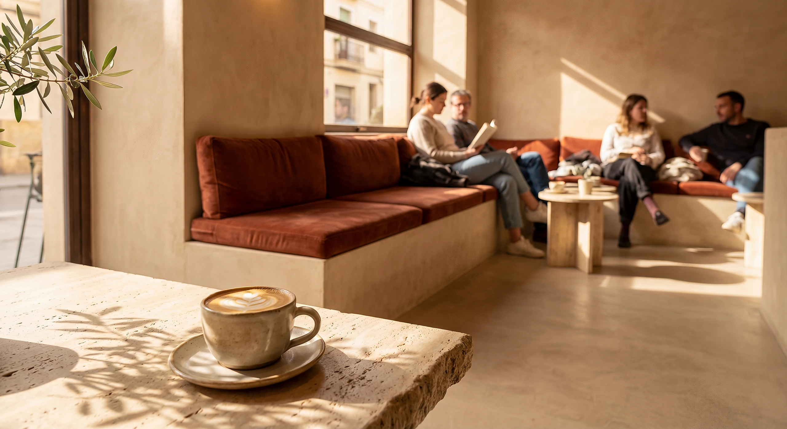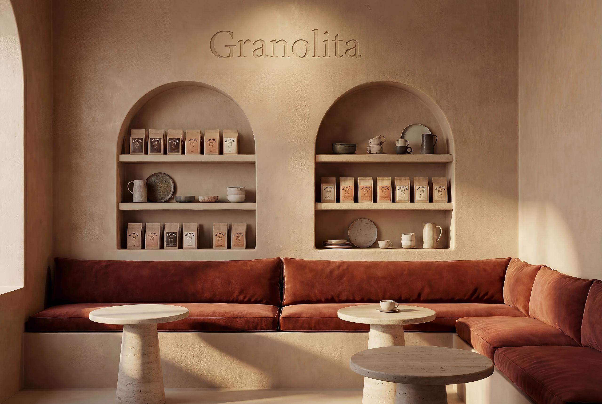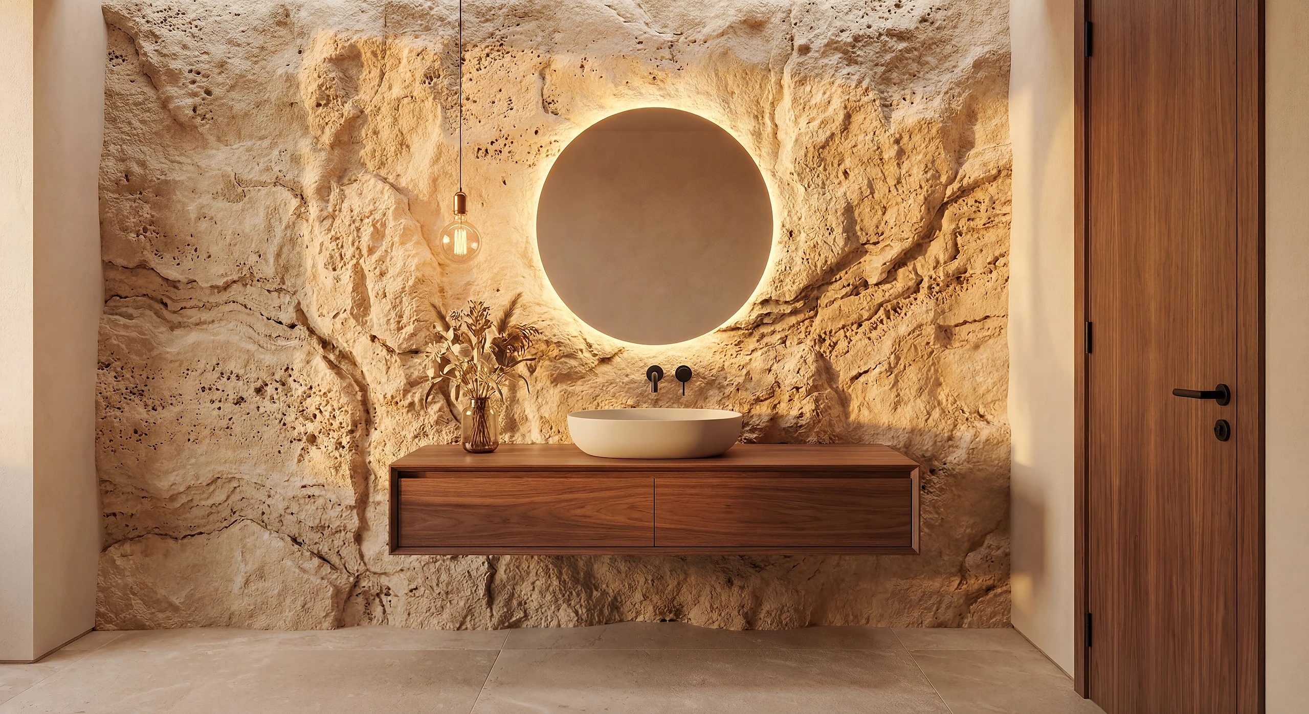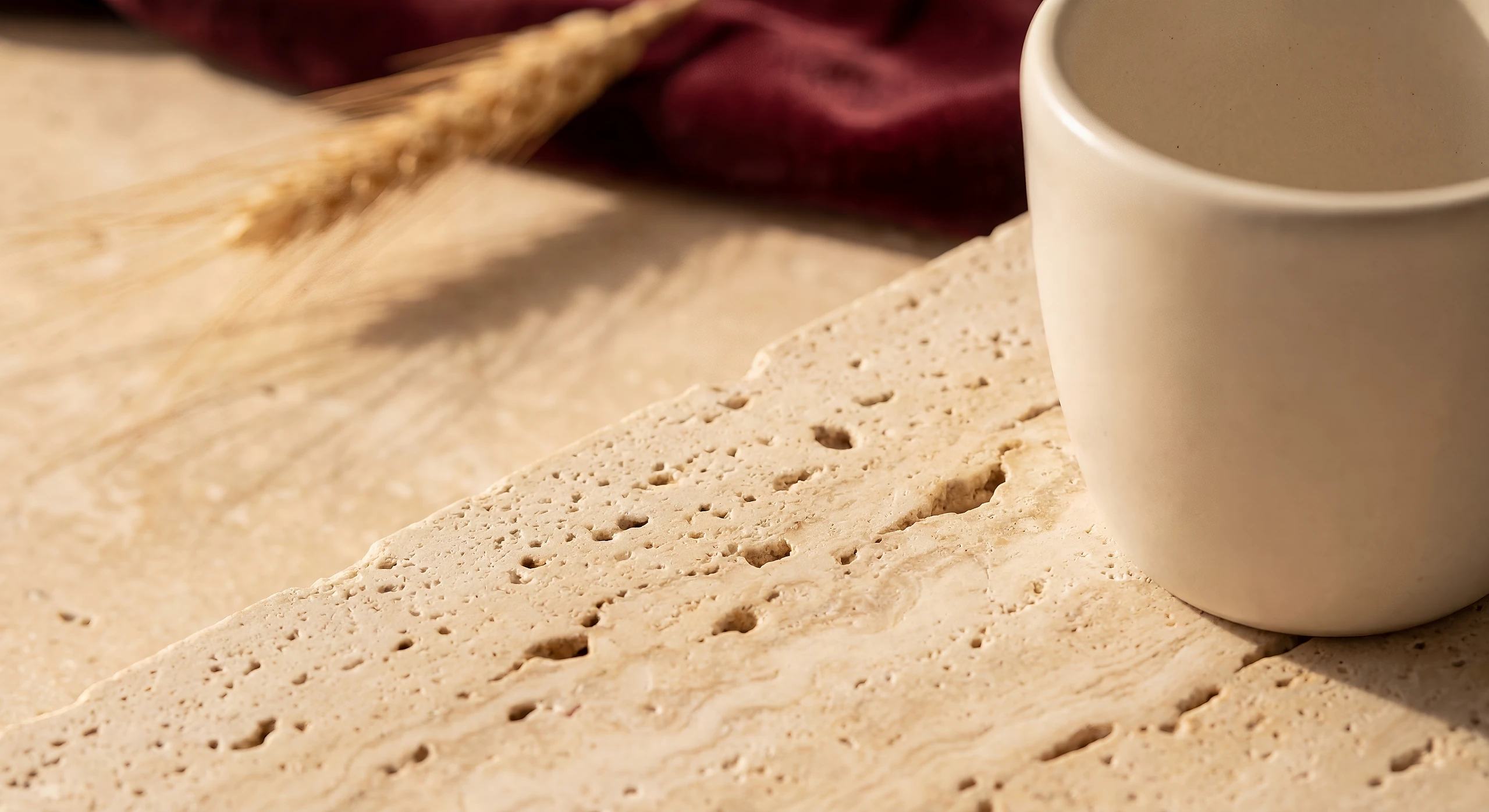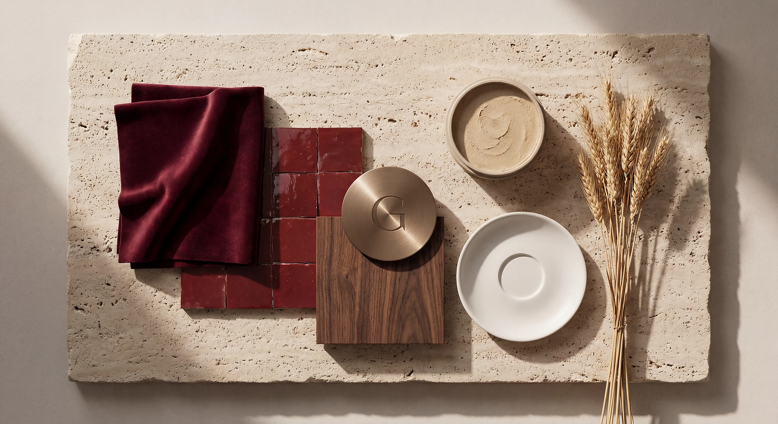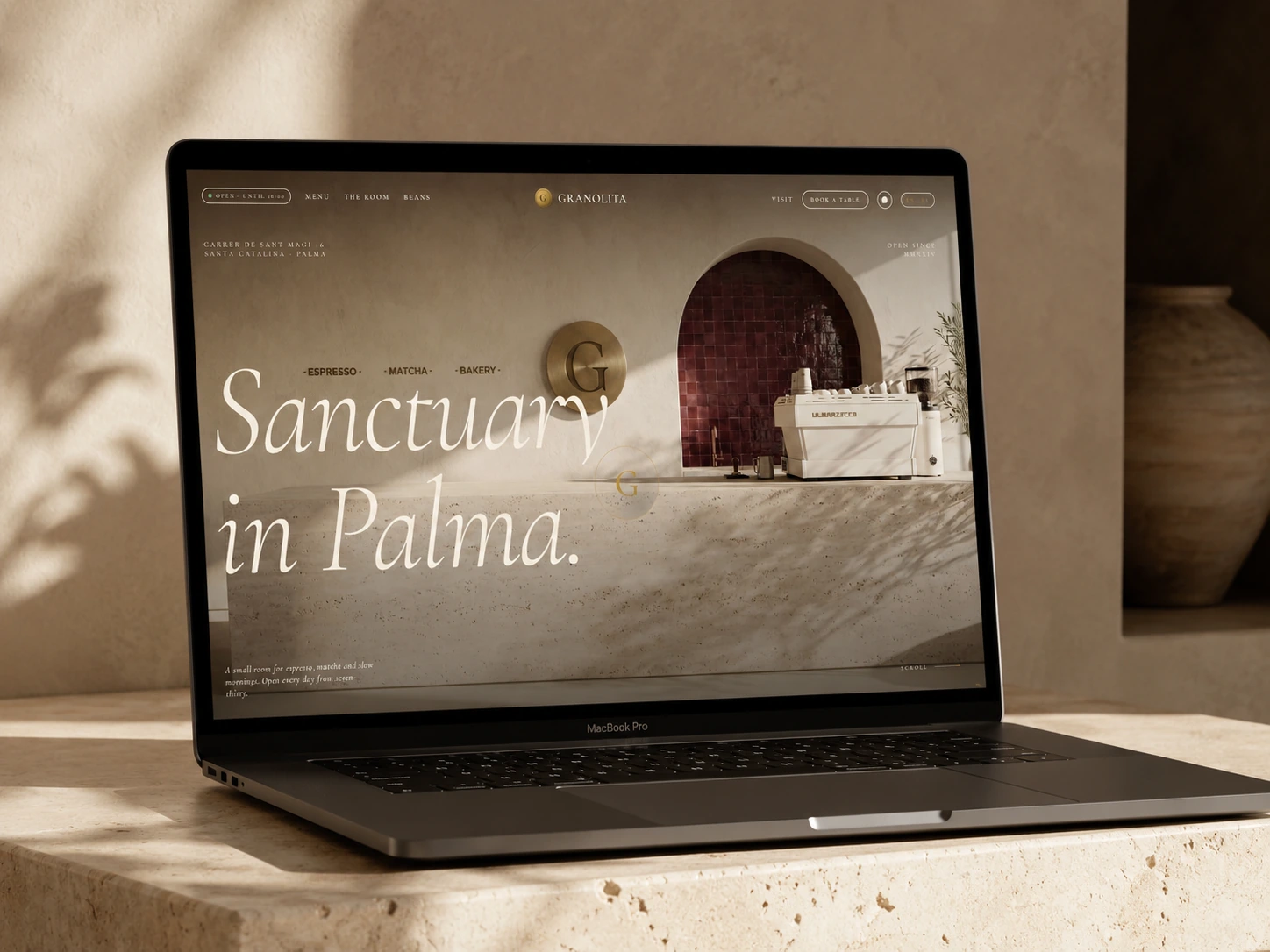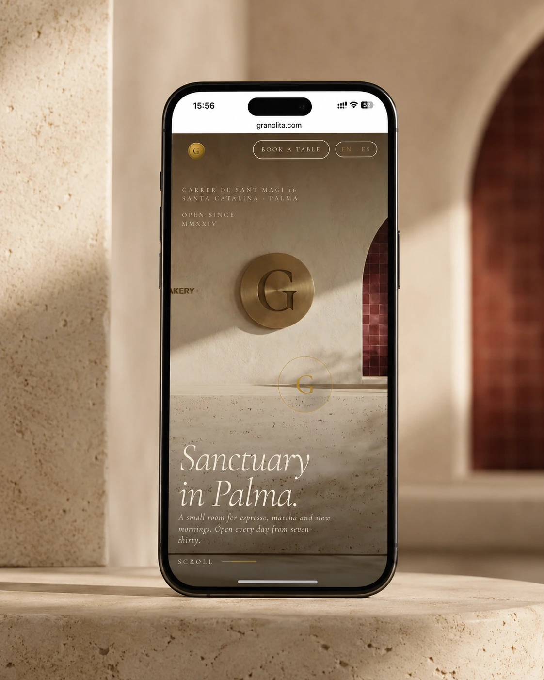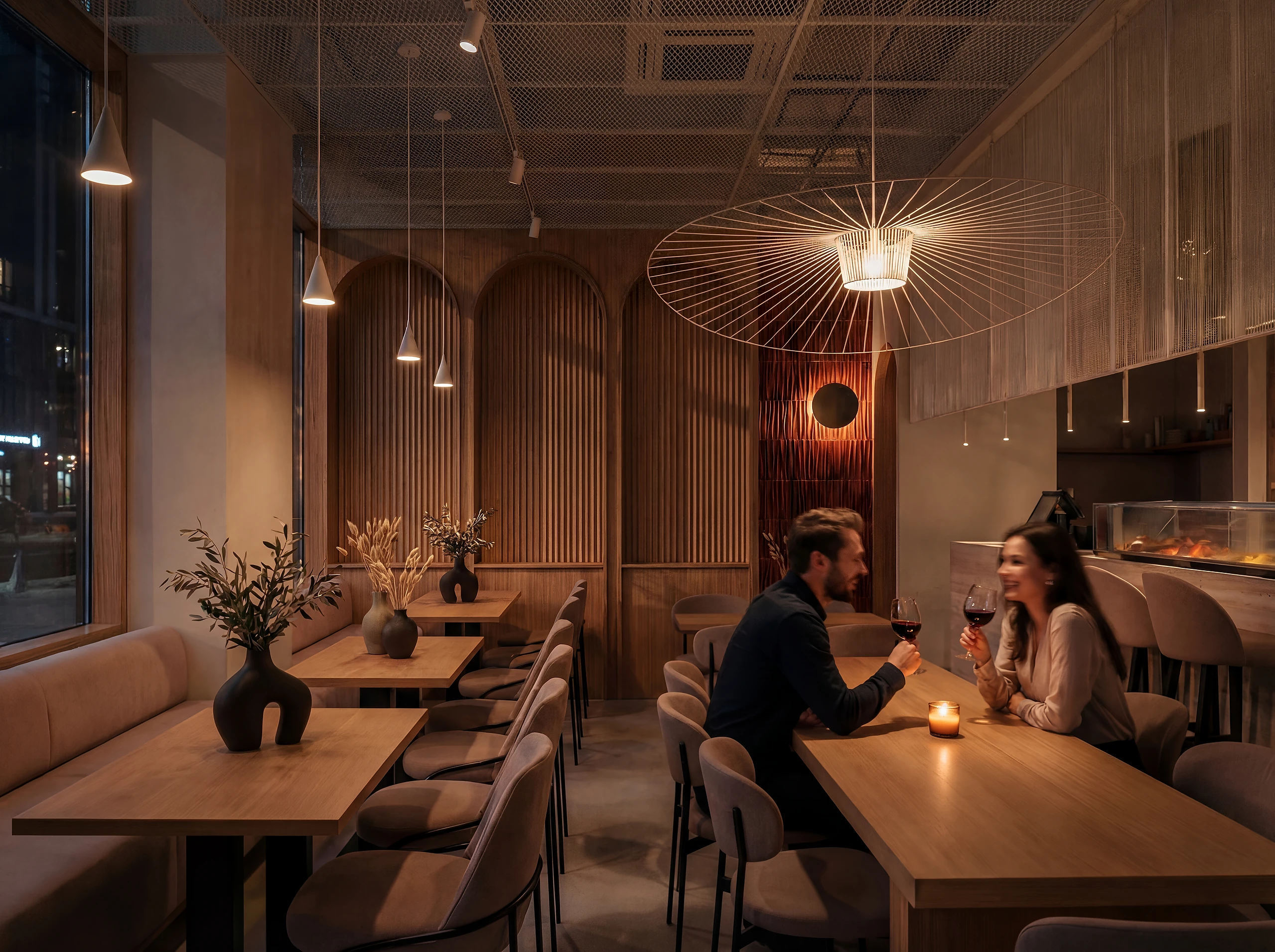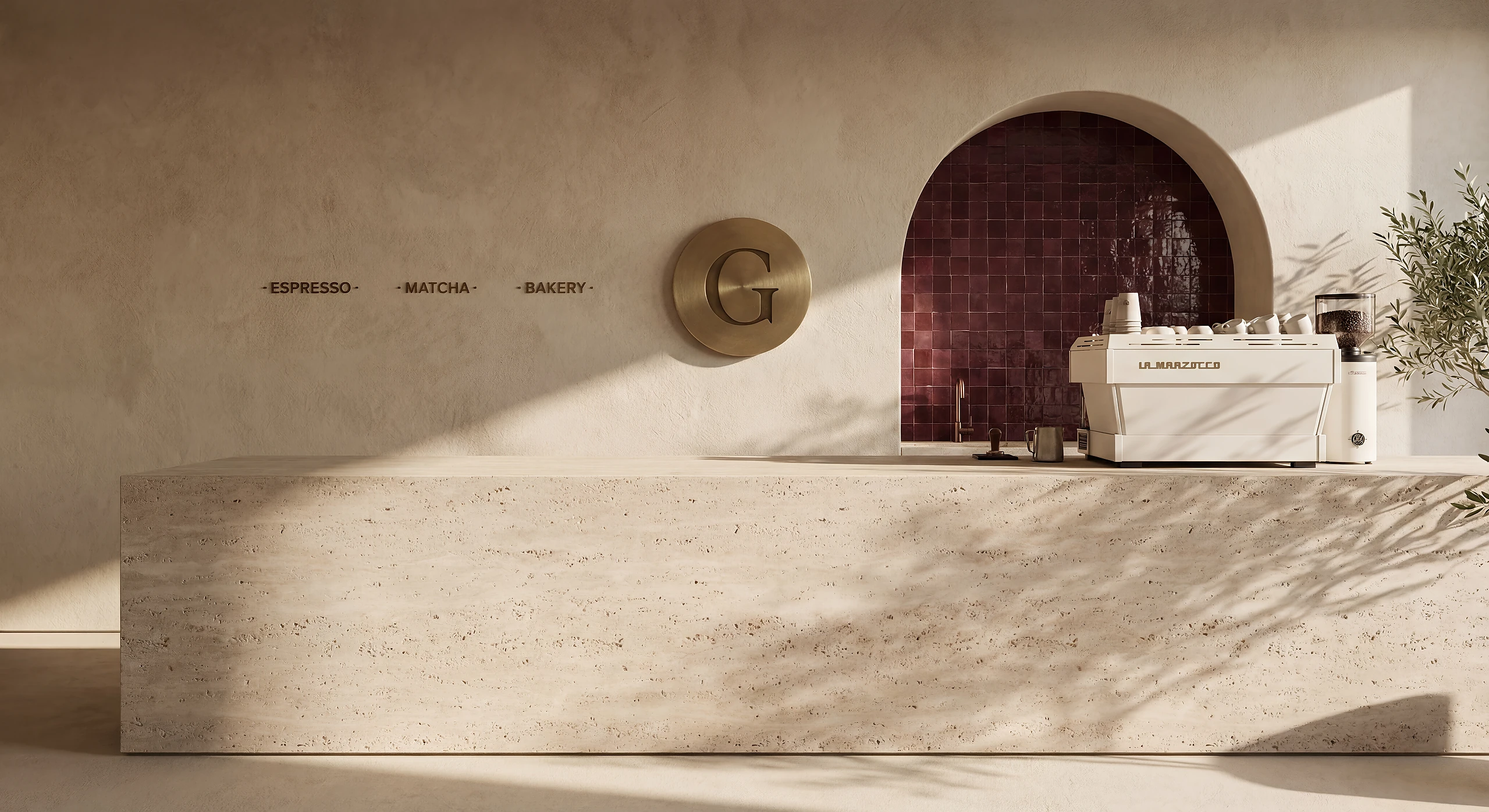
The customer does not separate the space from the logo and the site. They read as one thing, so they were designed as one thing.
Sector: Cafe and bakery
Services: Commercial interior design, commercial branding, web design & SEO
Brief and objectives
- A counter and a flow that serve takeaway without blocking the seated customer.
- An identity that works on the facade, on packaging and on screen.
- A website that leads to an order from the phone, not to a photo gallery.
- Signage that explains the product without needing explanation.
Solution
Brand strategy
A logo, colour palette and typography that convey freshness and a modern feel.
Spatial design
A modular design concept with durable materials and controlled execution costs.
Total integration
Packaging, menus and signage for a consistent customer experience.
Result
- The same image on the facade, on the packaging and on the website.
- A flow that serves takeaway and seated customers without conflict.
- A system the shop team can run without us in the room.
Key points
- Space, brand and web decided together.
- A flow that serves takeaway and seated customers.
- A system the shop team runs on its own.
See the live site: granolita.com
This is a representative selection of our work. Other projects, documentation and references can be shared during a private consultation.