Plenty of businesses pay for a logo and think they have bought a brand. Then, a year later, every page, deck and post looks slightly different, because there was never a system underneath. A brand identity is not a mark. It is the set of decisions that lets everyone make the same choice without asking.
Here is what a finished identity should hand you.
A useful way to judge it: if the person who commissioned the brand left tomorrow, could the company keep making things that look and sound like itself. If the answer depends on that person being in the room, what was bought was taste, not a system.
A position, written down
Before any design, a real identity settles who you are for, what you stand against, and the few words that hold it together. This is the part that survives redesigns. Everything visual is downstream of it.
It is also the part clients are most tempted to skip, because it produces no image to approve. Skipping it moves the decision rather than removing it. Someone still decides who you are for, it just happens implicitly, in a hundred small choices, by people who were never told what the answer was.
Written down, it does not need to be long. A sentence on who it is for, a sentence on what you do that the alternatives do not, and a short list of what you will deliberately not be. Most of the value is in the third one.
A system, not a picture
The mark, the type, the colour, the layout logic and the tone of voice, plus the rules that let a junior designer or an outside agency apply all of it correctly. A brand you cannot hand to someone else is a brand that stops the day you do.
The parts that get forgotten are the ones nobody presents: how the logo behaves when the space is tight, what happens at very small sizes, what the second and third level of typography are for, how photography is cropped, what the brand sounds like in a complaint email. Those are the situations your team meets every week, and an identity that only covers the launch leaves them guessing.
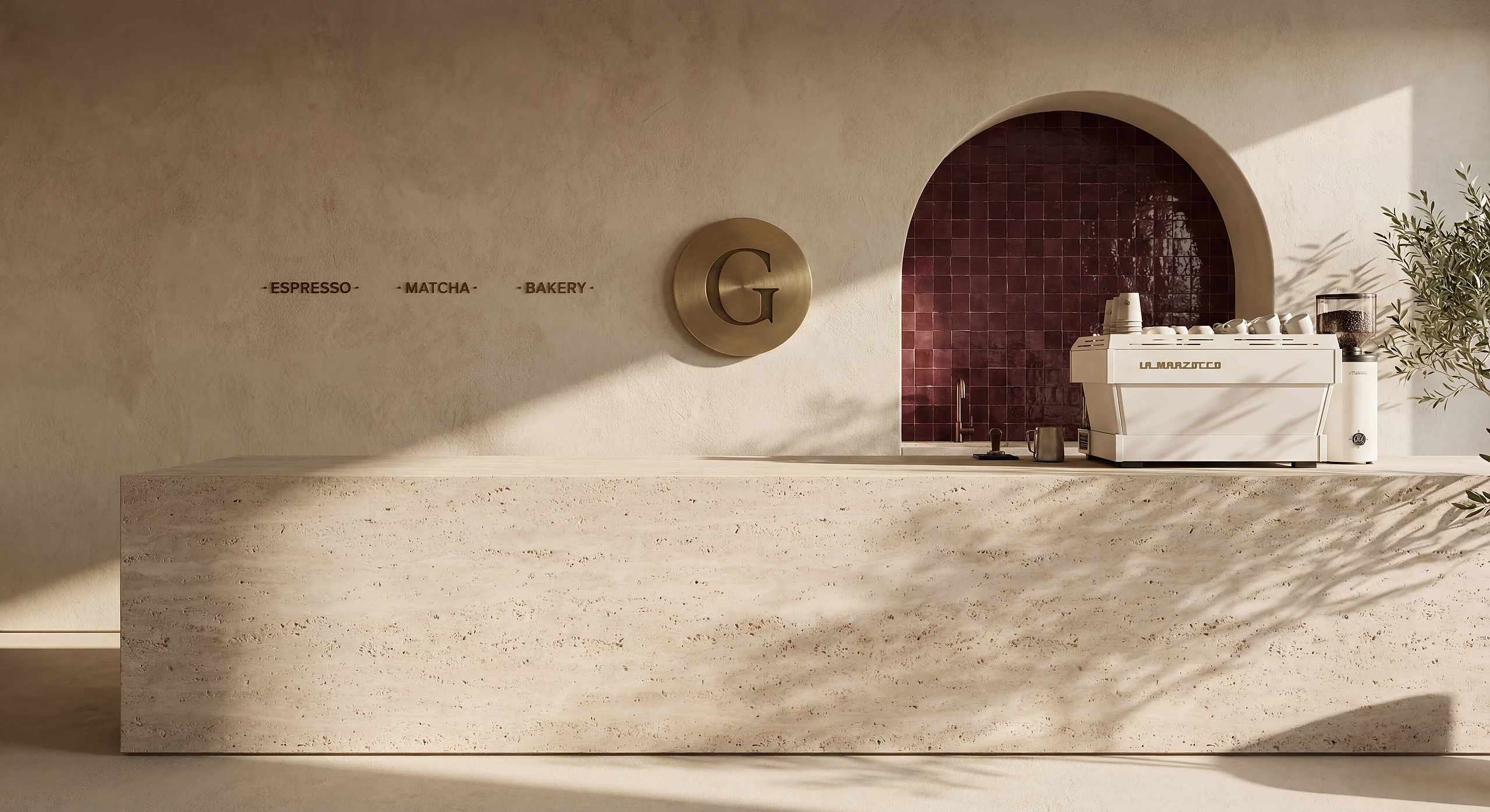
Where a brand lives in a physical space, the system has to reach that far as well. Signage, materials, wayfinding and the way a name sits on a door are brand decisions with a construction cost attached, and they are far cheaper decided with the identity than retrofitted to it.
Guidelines built for use
The test of guidelines is simple: can the people who ship your work follow them without you in the room? If yes, the identity is doing its job. If your team keeps asking what the brand allows, the system is incomplete.
Length is not the measure. A short document people actually open beats a hundred page manual nobody has read. The useful ones are organised around situations rather than assets: here is what to do when you are making a social post, a proposal, a sign, a menu. That is how the work reaches people, so that is how the guidance should be filed.
What it is worth, in business terms
A finished identity removes a recurring cost that rarely appears on a budget line: the time spent deciding things that should already be decided. Every deck reformatted, every post argued over, every supplier briefed from scratch is an hour that the system was supposed to save. Across a year, in a company that ships regularly, that is the largest number in the case for doing it properly.
The second effect is slower and larger. Recognition compounds. A business that looks like itself everywhere it appears becomes familiar faster than one that spends the same money looking slightly different each time, and familiarity is what lets you charge above the alternative.
Where identities usually fail
Three failures account for most of it. The identity was designed for a pitch rather than for a year of production, so it looks superb once and awkward thereafter. It was never tested against the ugliest real case, a tiny app icon, a one colour print, a cramped sign, so it breaks the first time reality arrives. Or the position underneath it was borrowed from a competitor, so the whole system is describing a business that does not exist.
The way to avoid all three is to test the identity on real work before it is signed off. Make the awkward things, not the showcase things, and see whether the system holds.